R6X Y10 battle pass
How we matched modernized requirements to release non-linear battlepass tracks 2x faster.
.brief

problem
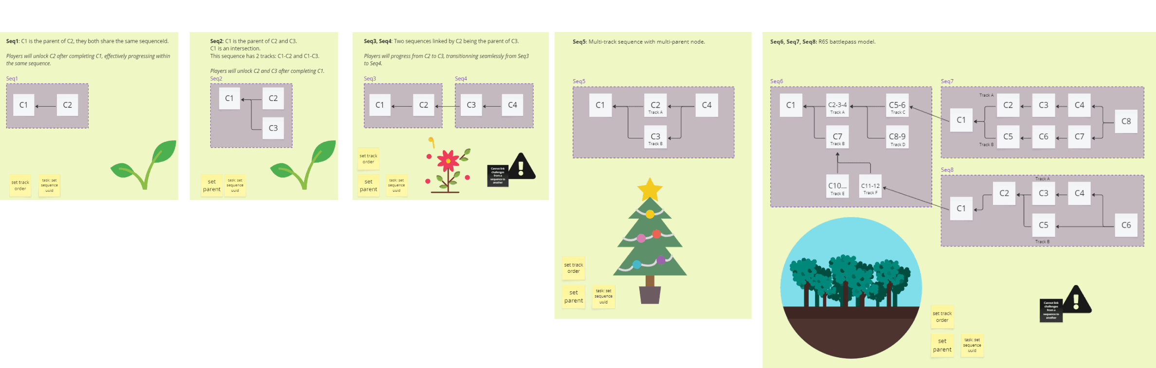
A battlepass is usually defined with two tracks: freemium and premium. Our client, has gamified this system: players now progress by completing challenges in a new, non-linear way, which includes branching and unlockable paths. Our backoffice apps did not account for this sort of evolution, and we need to build a solution before our client's 10th anniversary event, because this will be a big update. Currently in the planning phase, our client's game designer will be ready to ship for testing at the end of the quarter.
solution
A small squad of product owners, project managers, engineers, and myself - have planned, designed and built a CMS app which leverages modern interaction patterns to manipulate bigger volumes of data at once.
→ Y7S4 battlepass (by u/BunKuro)
I contributed at nearly every stage of this initiative, from ideation to product release. I had to jump back and forth between all parties as I was the sole designer on board, and made sure to document any progress and highlight potential improvements for our enterprise design system.
year
2023
timeframe
Q3 Q4
tools
Figma, Miro
category
UX, UI, research, strategy
How might we… take this opportunity to pay-off some technical debt?
The lead engineer mentioned his team could build a new app but lacked front-end expertise. The existing solution is built with legacy tech that isn't worth training on.
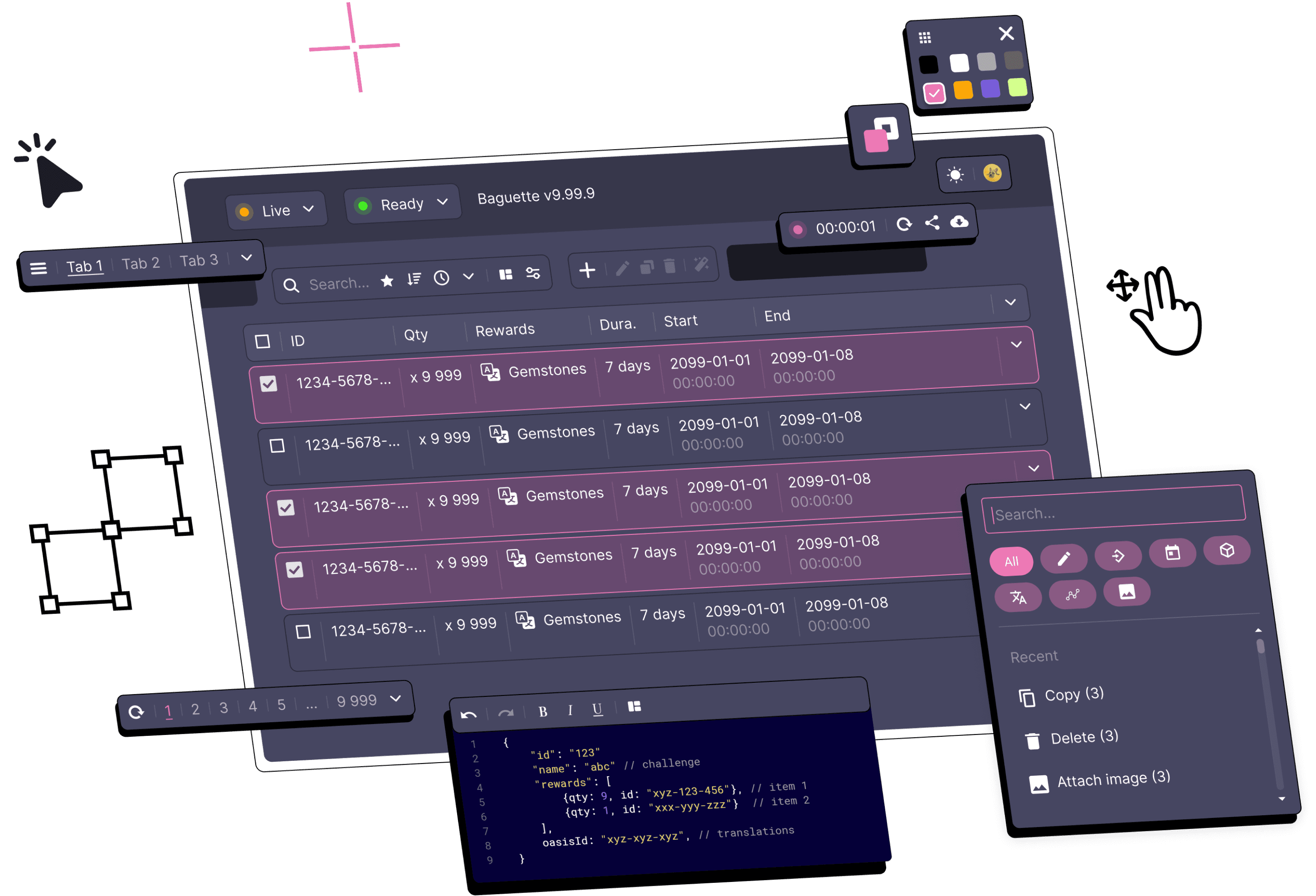
I mapped some workflows to explore how interactions between services could be improved. This led to introducing a new scrollable form page template, a formal table layout with built-in selection and “batch” actions to the design system and guidelines.
→ This high-profile project has the potential to carry forward numerous isolated initiatives into one big step forward.
→ Some pages and components were added to the company design system, so other projects may benefit from conventional layouts.
How might we… make this new app more intuitive and faster to use?
The client reached out with a list of pain points we had observed in other apps too, this was a good opportunity to improve our interaction guidelines and documentation while we were fixing these inconsistencies.
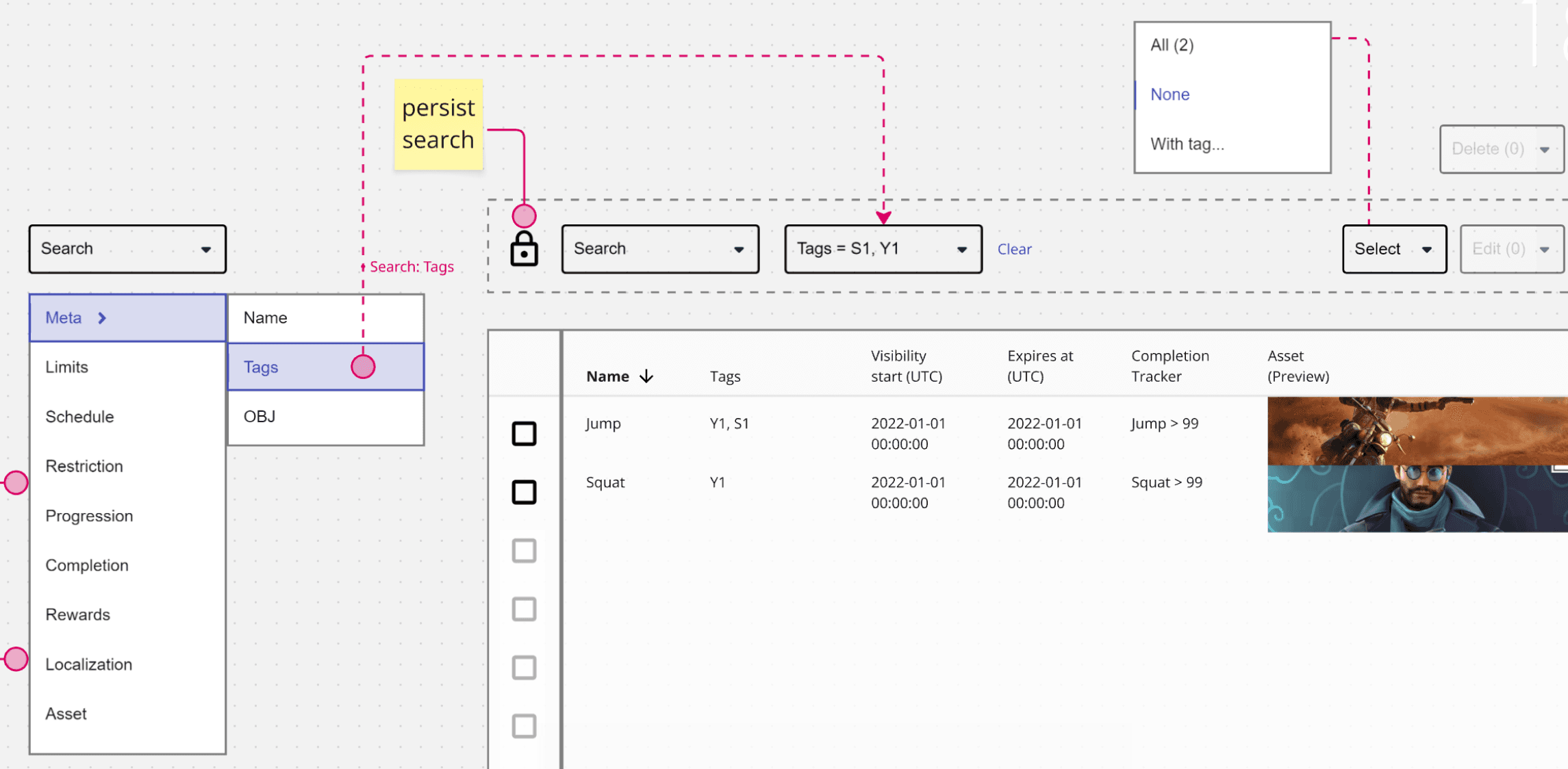
Some of the users pointed out that our pages didn’t display data in a meaningful order for them: “This order looks completely random”. This comment alone highlighted a series of weaknesses in our service, which simply wasn't built to manipulate such amount of data at once, or even able to display it in this particular order.
→ Our strategy needed to pivot from “edit a single resource” to “manipulate page(s) of results at once”.
Based on feedback and after several iterations with a handful of stakeholders, I designed new interaction patterns with a two-fold objective: provide immediate value to the user, and smooth integration into the company’s design system later on.
I wrote a handful of articles alongside, mostly documenting these new types of interactions, describing how services should handle such requests, and how apps could progressively adopt and extend these features.
→ introduce “batch manipulations” and lift some restrictions on cross-service validators to allow draft and template resources
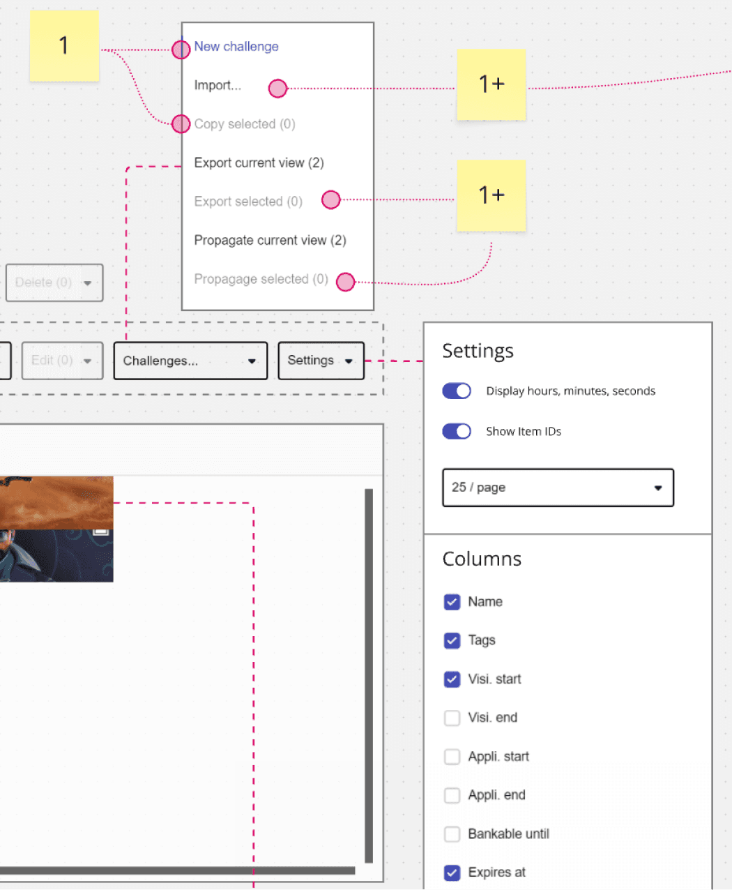
→ introduce import, export and view settings to help teams inject, extract and visualize data in our services
Introducing batch actions has impacted the way we organize and display interactions at large. As an example, our template layouts had to move from a toolbar capable of displaying 3-5 actions to a dynamic menu, which would scale for dozens of possible actions.
To support this new structure, we defined some basic events and conditions - the latter will restrict or enable actions based on selection count, session privileges, data status, etc, which resulted in highly flexible rules - an essential asset for successful adoption.
How might we… automate or accelerate some of the client's processes?
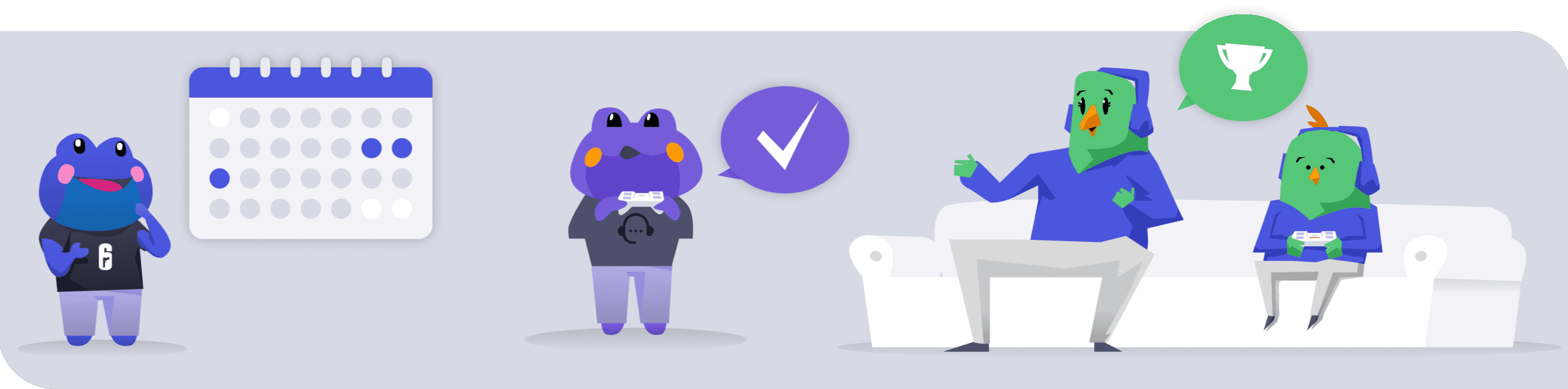
One of the squad members worried about other collaborators who would interact with the same content - but at later stages in the development process.
We found out that at least three other teams - testers, live ops, support - were directly involved, however much later in the process. All of them had unique struggles, incentives and objectives - and had to resort to painful workarounds, cost them valuable time, and cause frustration.
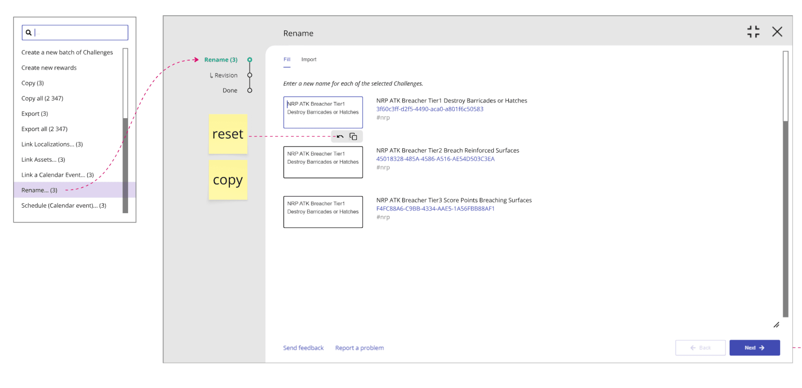
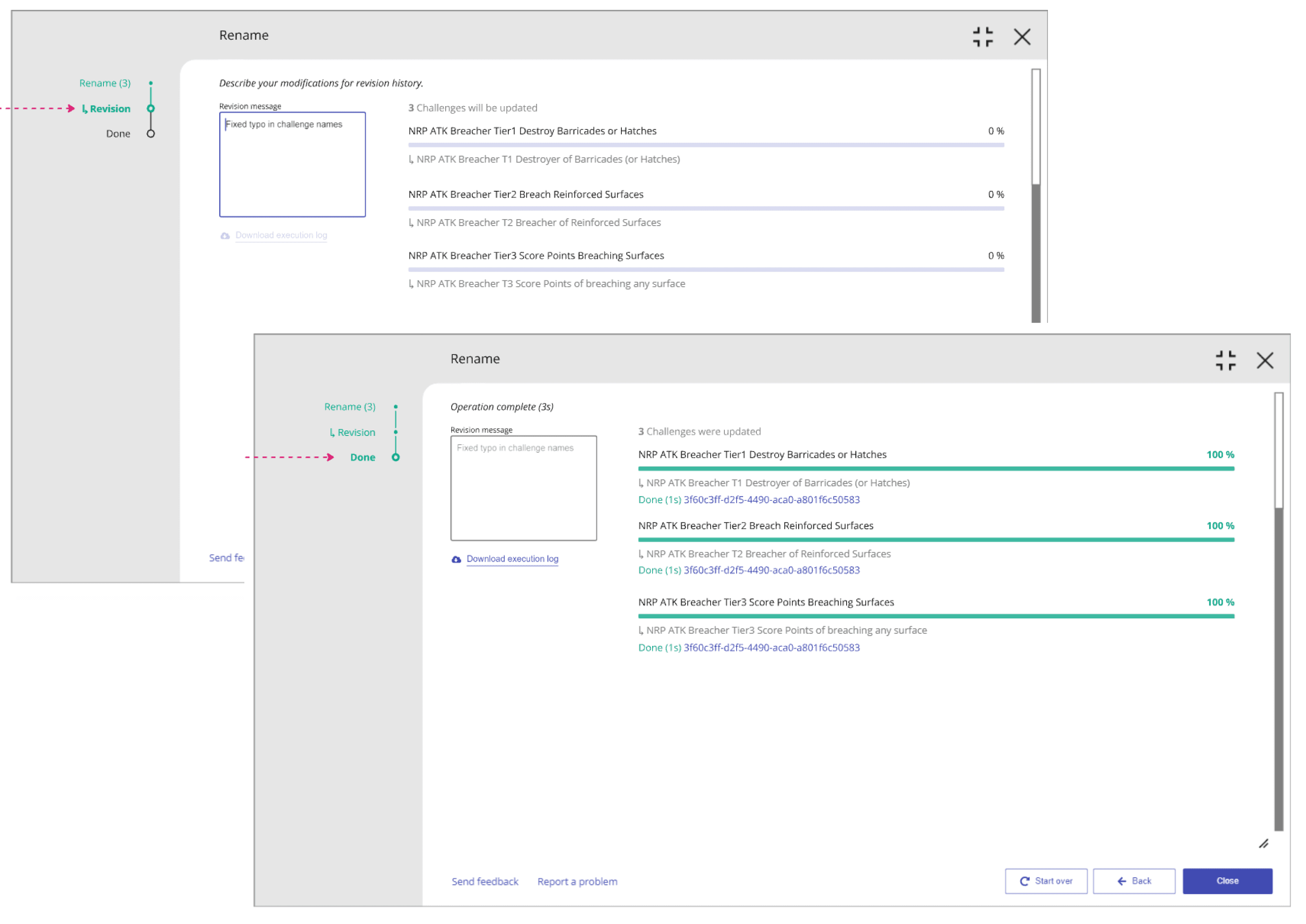
To solve this issue, I designed “workflows” as a feature with automation and extensivity in mind.
→ Any redundant task or scenario could be scripted into a form which would send a few API requests when submitted. The cost of building a mini-app tailored for a specific workflow is very low, we could afford building a starting collection of short, popular and hyper-focused flows like this.
→ My first mock-ups diverged too much from our API signature and code complexity started to accumulate. We had to back track on some features to meet API capability, however the core UI elements of the feature were already laid out and didn’t change much until release.
Taking into consideration the client's quality, release and support teams has positively influenced adoption and trust. As you can see below, we added extra feedback on activity duration and progression, access to support from within the workflow, and access to execution artifacts after completion (or interruption).
Roadmap and delivery
It only took a few days for our engineers to build a functional MVP which we took to the client for a first round of testing.
We iterated a few more times after this, adjusting the product as feedback started rolling in from all directions. The core concepts I introduced were validated through implementation, and proved to be effective.
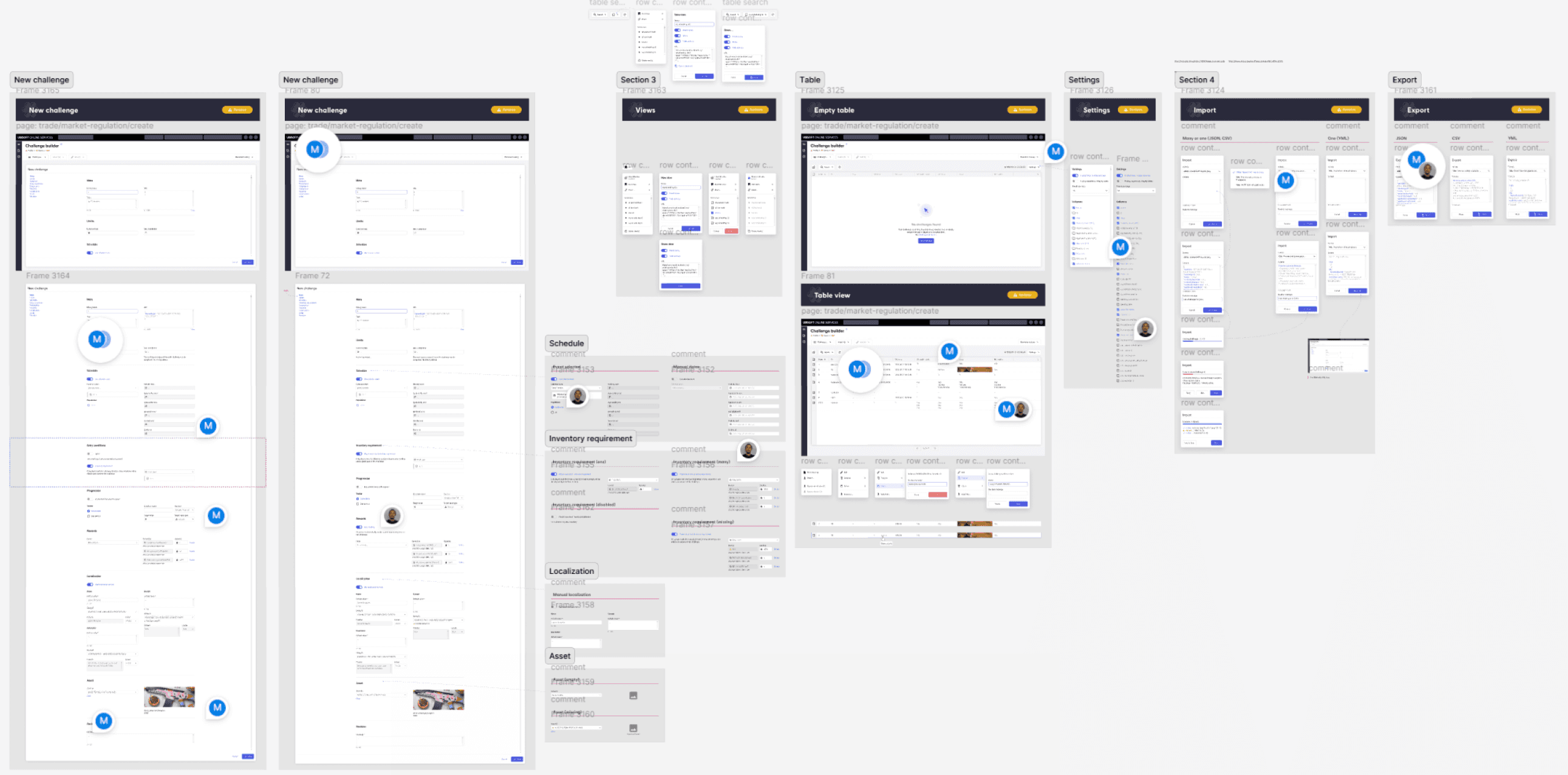
As we moved forward, I was able to design and wire-up demos featuring high-fidelity mock ups of all the main flows, forms, pages, modals, menus, search, empty and error states... each and every feature that had made it past the technical break-down stage was show-cased individually and illustrated with interactive demos.
→ Features release plan for the end product, split into 4 deliverables.
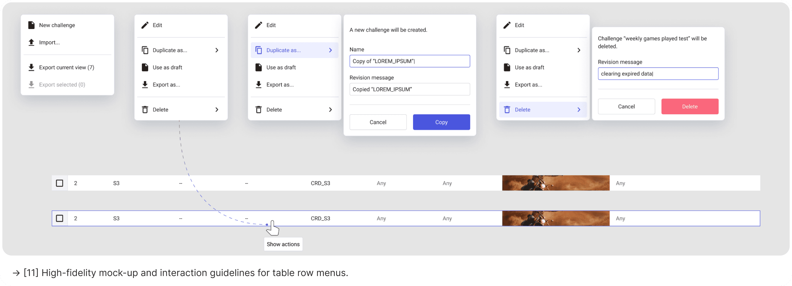
→ High-fidelity mock-up and interaction guidelines for table row menus.
01

02

.final thoughts
Final thoughts - o(* ̄▽ ̄*)ブ
The legacy app was obviously not built to handle 10 years of accumulated service data, and hasn't been updated in ages - I wish we had tracking analytics data available to set a baseline for improvement.
My bottom-line objective was to make this solution useful at any stage of a game’s development - this includes unannounced WIP projects, long-established IPs, and live games looking to onboard this solution. We would historically engage with these partners on drastically different levels of requirements, ownership, engagement, semantics, player populations, even sometimes with conflicting goals.
Success came from good coordination within the squad and our iterative approach, which allowed us to refine the solution and ultimately release a tailored and scalable end product.
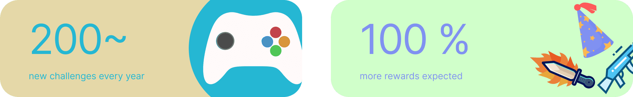
Now, our major partners can bundle twice as much rewards, without spending any extra time.